Adding a Feature
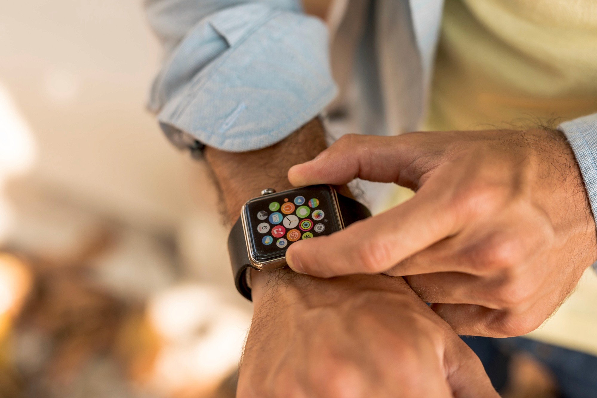
Apple Fitness, integrated with the Apple Watch, offers a comprehensive workout tracking system.
The current Apple Fitness and watchOS ecosystem lacked a crucial component— a rest day option.
/ Goals
Revolutionize user interaction with the Apple devices on days dedicated to recovery.
/ Tools
Figma, Miro, Google Form, Google Sheet
/ My Role
UXUI Designer
UX Researcher
/ Timeline
Dec 2023 - Jan 2024

Problem
I surveyed total of 62 participants who are currently using Apple Fitness and Apple Watch to track their daily workout routines.
The goal was to see if integrating the rest day feature into the application is beneficial to the user.

/ Data Highlights
85% of users deemed rest days important in their workout routine.
Over 50% felt disappointed or pressured by incomplete rings.
There is a significant demand for a feature that recognizes and celebrates rest days.
Meet Emma.
How might we help Emma to balance her fitness routines without feeling guilty about rest days?
Hands On!
This phase involved transitioning from broad research insights to solution frameworks.
With mindful considerations of IOS and WatchOS, wireframes and prototypes were designed tailoring to user needs.

/ Make Them Consistent
A consistent and intuitive user interface was crafted, ensuring the Rest Day feature seamlessly integrated into the existing ecosystem, regardless of the device.
/ Make It Different
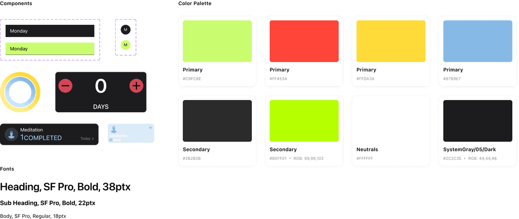
To distinguish rest days from workout days, the palette of light gold and blue was selected, aiming to evoke a sense of relaxation and tranquility.
Light gold mimics the serene glow of dawn, symbolizing peace and freshness, while blue reflects the sky's calming presence, promoting a soothing and restorative atmosphere.
Is It Working?
Total Participants: 6
Number of Tasks: 3
Duration: 1 hour
Goals: Evaluate user interaction with the rest day feature and ascertain the feature's utility on watchOS.
Methodology: Conducted both in-person and via video screen sharing.
/ Schedule Rest Day Routine
Success Rate:
80% managed to schedule a rest day without help.
User Feedback:
Users found the "lightly, moderately, highly" levels confusing.
Users would like a confirmation on the rest days they have selected.
Users would like to see confirmation immediately after selecting.
/ Choose a Rest Day Activity
Success Rate:
100% could select a rest day activity seamlessly.
/ Skip a Scheduled Rest Day
Success Rate:
100% correctly navigated to skip a rest day.
User Feedback:
Users found it confusing since no interaction is displayed after they clicked the button.
Continuous Improvements
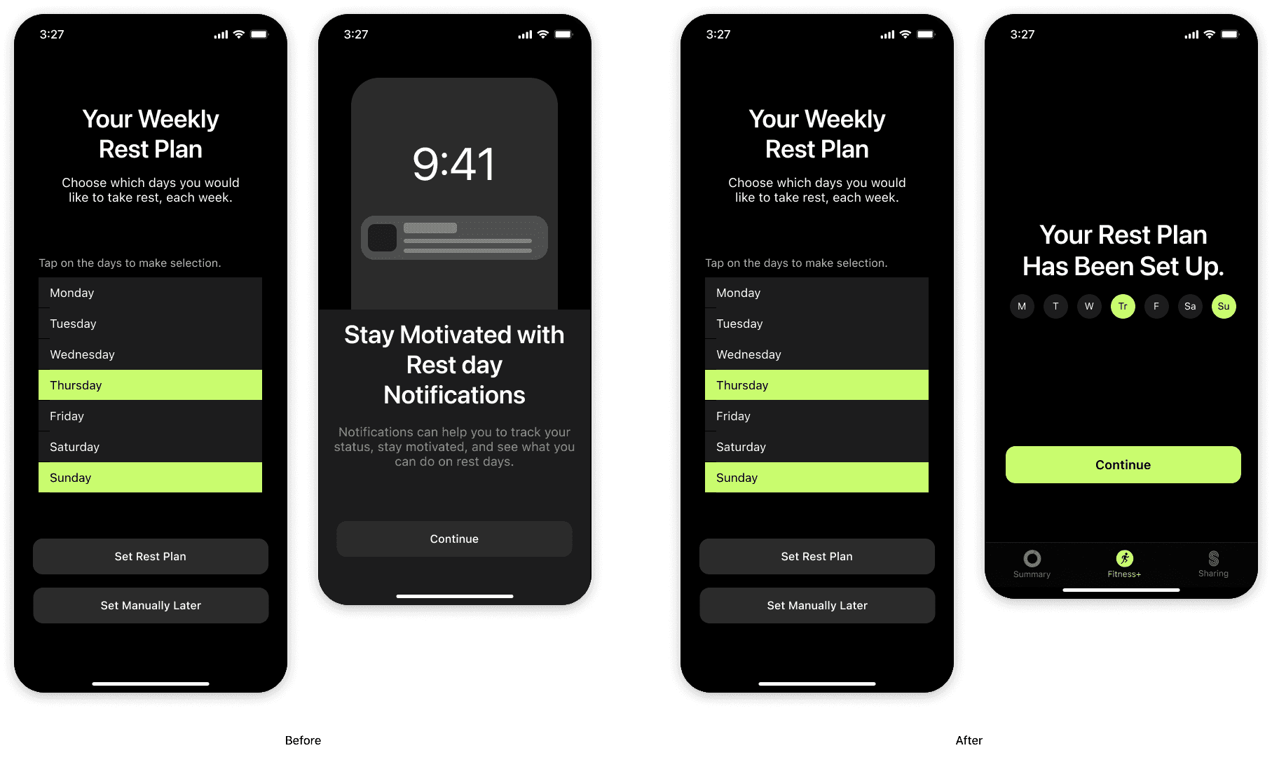
The following screens show before and after images of how I applied the feedback and results from user testing.

/ Eliminated Rest Day Intensity Options
Before: Participants found the "light," "moderate," and "high" intensity options confusing.
After: Eliminated the intensity options sincen they don't significantly enhance the experience and caused confusion.

/ Enhance Confirmation Page
Before: There is no summary or "receipt" of selected rest days for verification and error prevention.
After: Added a summary feature to the confirmation page, acting as a receipt for users' selected rest days.

/ Optimize Confirmation and Notification Flow
Before: The confirmation page comes after the notification page.
After: Revised the flow to display a confirmation page immediately after rest day selection, followed by rest day notification options or information.

/ Implement Post-Activity Duration Display on Apple Watch
Before: Post-activity, users cannot see their session duration, highlighting a gap in immediate feedback for rest day activities.
After: Introduce a feature displaying the duration of rest day activities right after completion for immediate user feedback.
What I've Learned
/ Cross-Device Design
Designing for the Apple Watch has been an enlightening journey.
The smaller screen size forced me to prioritize the focus points, ensuring that only the most essential information and features are presented to the user.
This process has deepened my understanding of user preferences for wearable devices, emphasizing the need for simplicity and direct access to key functionalities.
/ Apple Design System
Immersing myself in the Apple Design System has been incredibly educational, offering insights into the balance between aesthetics, usability, and simplicity.
I've learned to work under the guidance of a cohesive design system that supports a seamless user experience across devices while maintaining a high standard of visual design.
Looking Forward
/ Enhancing Recovery Activity Lists
Based on user feedback and my observations, I plan to expand the list of recovery activities available to users.
This will provide a broader range of options to suit different preferences and recovery needs, making the rest day feature more versatile and user-friendly.
Offering more options will also encourage users to engage more deeply with the app on their rest days, supporting a more holistic approach to health and fitness.
/ Customization of Colors on Rest Days
I intend to introduce the ability for users to customize the UI colors on rest days.
This innovative feature is designed to empower users with the flexibility to tailor the UI colors to their preferences on rest days. It's a step towards making the app not just a tool, but a personal companion on their fitness journey.

Get in touch


